
 Dansk
Dansk
 English
 Deutsch
The colours of the Empire style interior in Frederik VIII’s Palace at Amalienborg
Conservators from the Royal Danish Collections at Rosenborg and Amalienborg worked on the task of re-creating the colours of the interiors in Frederik VIII’s Palace.
The conservators were among the first of the specialists who started to work on the renovation of the old palace, beginning by investigating the history of the colours that had been in it on wooden panels, doors, walls and ceilings. It was the period from 1828 that proved to be the most interesting.
The woodwork had been painted in a warm pale grey colour throughout the building.
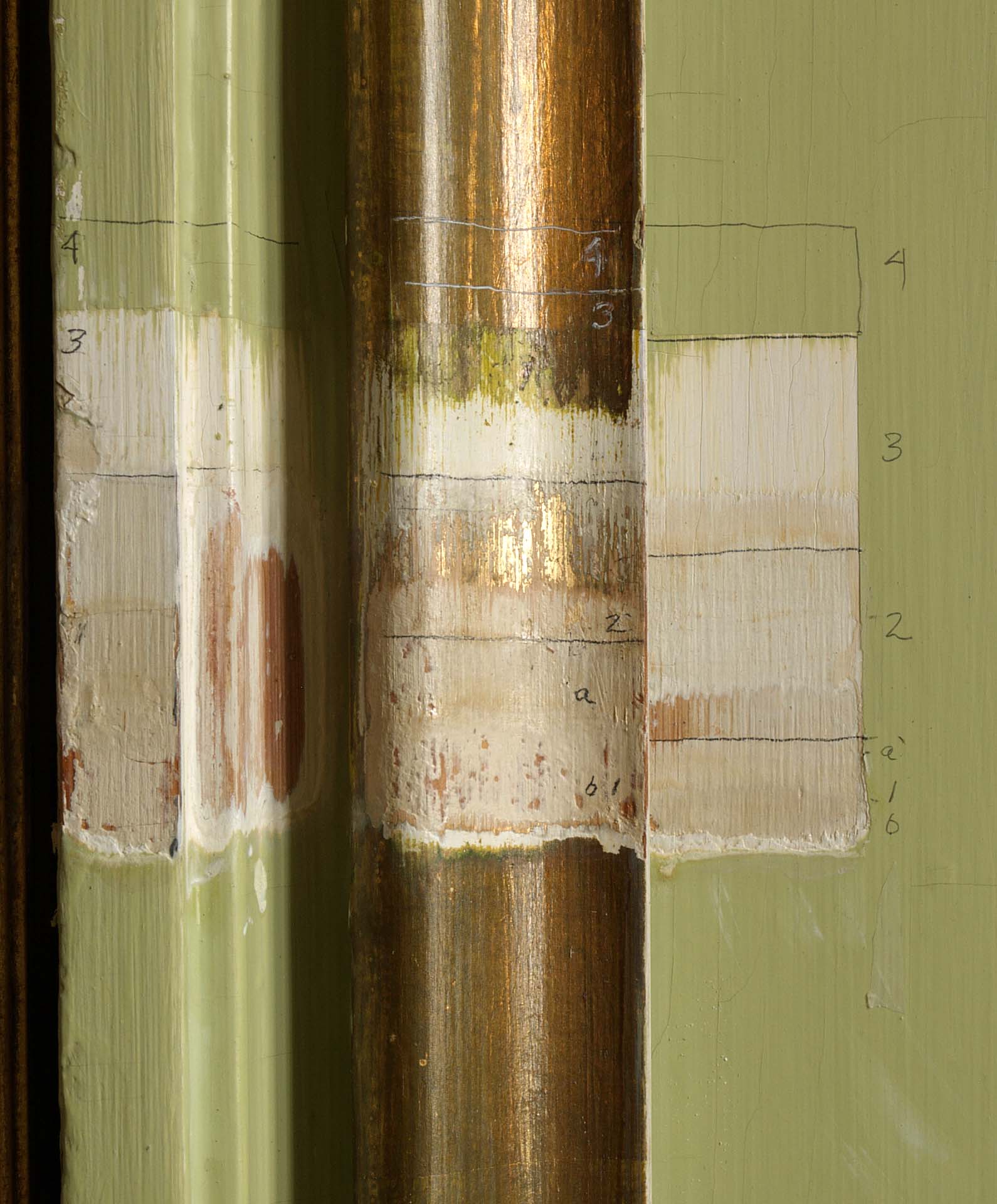
Here one can see from the exposed layers that the woodwork in this room has been painted 4 times since 1828. In addition a number of minor repairs have been carried out, but it is typical that the room has only been painted once per generation.
The few traces of previous colours of wall paint that can be found range from strong turquoise and pale blue through orange-red to more neutral colours.
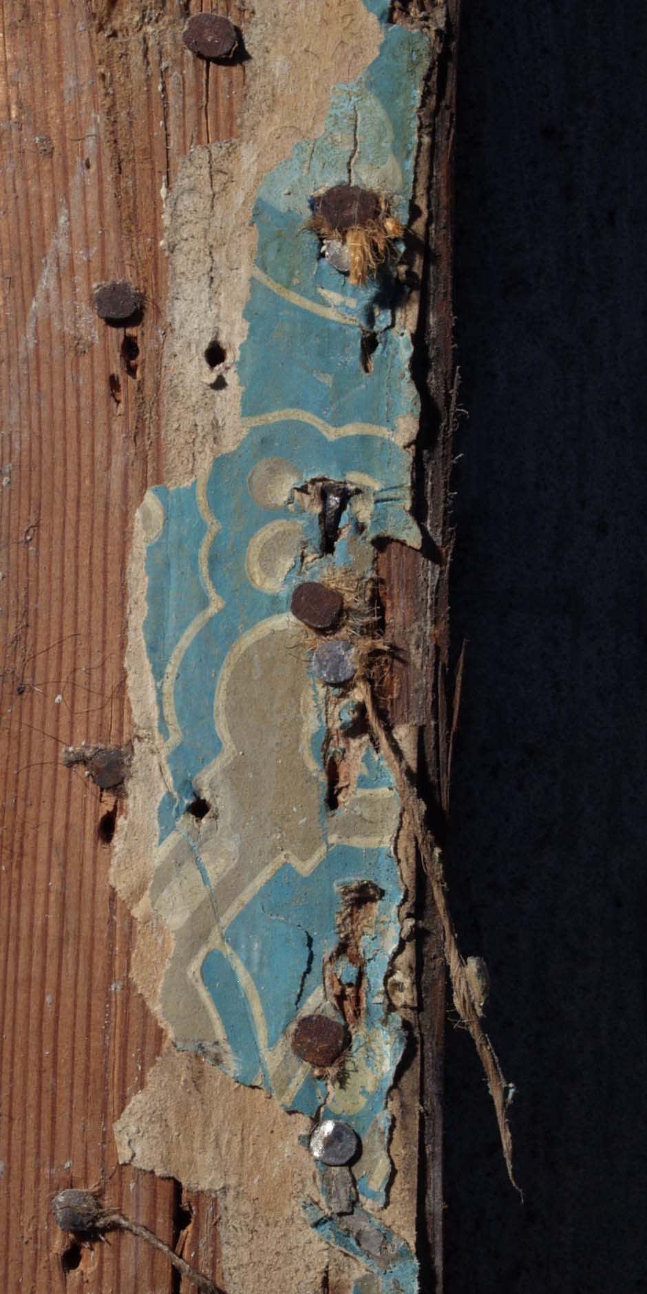
Here the remains of a turquoise green wallpaper with white patterns can be seen. Unfortunately the remnants found are not large enough to make it possible to identify what the depiction represents.
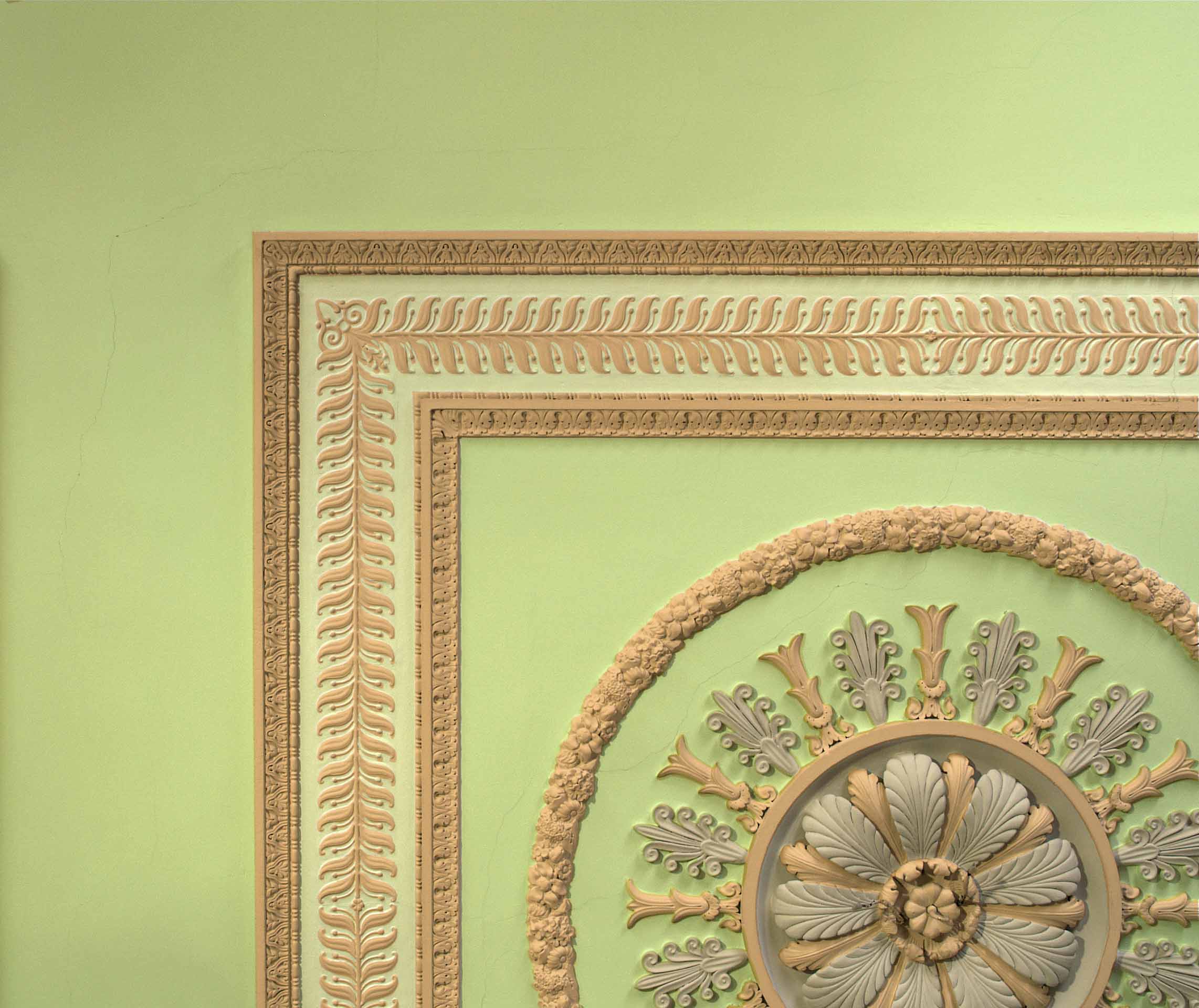
The painting of the ceilings is the most unexpected feature; they are richly decorated and have been painted in many different colours – green, ochre, blue, yellow, violet, pink – with only very little white.
These are small samples of exposed paint from the ceiling in the Great Hall of the palace.
The most simple of the decorated ceilings have two colours, while others have many more – up to 11 different colours, with dark and light colours both in the background surfaces and in the decoration. Contrast between matte colours and shining gold is very often used. The colour range and colour combinations are very striking on the ground floor, while the ceilings of the piano nobile have a more muted tone.
Læs mere om de farver og forgyldninger konservatorerne fandt på lofterne
The colours that are to be found on the ceilings, walls and woodwork were recorded and analysed with the help of what is known as the NCS system. This is a colour system that encompasses virtually all the colours that can be mixed. It is also used by painters and decorators.
Colours change over time – particularly colours that have been covered by other layers for a number of years – and traces of colour disappear because of rebuilding, washing down, etc. Colour-archaeological investigations therefore have their limits. It is not possible to restore a complicated colour design consisting of many different colours on detailed decorative elements and bring it back to a 100% faithful reproduction of the original. But one can come close.
The conservators concluded the colour-archaeological investigation with a comprehensive report covering all the findings, and this provided the basis for the decisions which the Palaces and Properties Agency – the authority responsible for the physical management of the building – took with regard to the further development of the renovation project, along with the restoration architects.
The colour traces found by the conservators were so interesting that it was decided to use reconstruction of some of the colour expressions from 1828 as a basis for the current renovation.
The renovation was intended to make the palace a modern dwelling while at the same time preserving the historic rooms to the extent that that was possible..
Strategy for restoration
Before the renovation was begun the various finds made during the preliminary investigation were analysed, and a restoration strategy was established for the work to be carried out. The visual goals were formulated at this stage and the properties of the materials to be used were determined.
Analysis of finds
It became clear that the decisive factor in the visual expression would be that it would reproduce the spirit of the décor in 1828. To ensure that this was carried through, a major research effort was embarked on in Denmark and elsewhere in Europe. The coloured drawings by the interior architect Jørgen Hansen Koch, presenting his plans for the palace interior in 1827, were particularly helpful in the analysis of the many colour traces found by the conservators.
It is one thing to find, observe and identify colour samples, but it is quite another to decide a colour scheme for a whole ceiling with a large number of different colours. It is not exactly easy to mix and replicate the colours one has found in a completely uncritical way. It turned out that one had to interpret the various finds in order to see if it could really be the case that the ceilings had once had the colours that had been found.
This was done by combining digital reconstructions with analyses of Jørgen Hansen Koch’s original drawings and other contemporary sources.
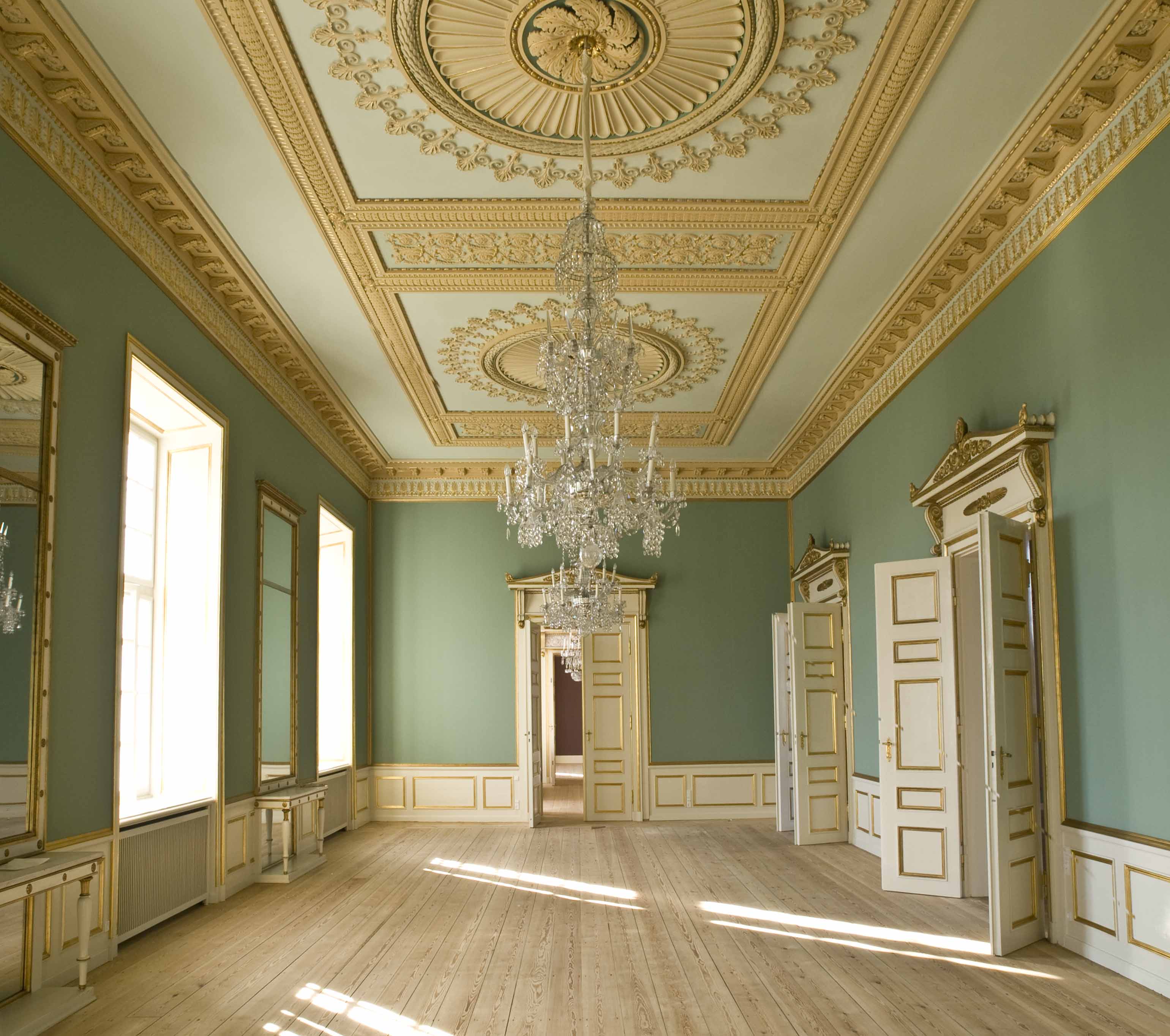
 Here are the ceiling colours in the Garden Room – sometimes called the Tapestry Room – reconstructed digitally.
At the bottom of this page you can see what the completed ceiling looks like.
Re-creation
After the work on digital reconstruction and analysis had been carried out, a number of experts were called in – a scientific advisory group – and the results were presented to them. Different models for the work to be done on the choice of colours were discussed.
The materials
The selection of the right materials is important to ensure that the final result will appear as characteristic of the original period as possible. For that reason as many of the old materials as possible have to be chosen.
For the painting of all the ceilings distemper was used, coloured with pigments like those of the original ceilings.
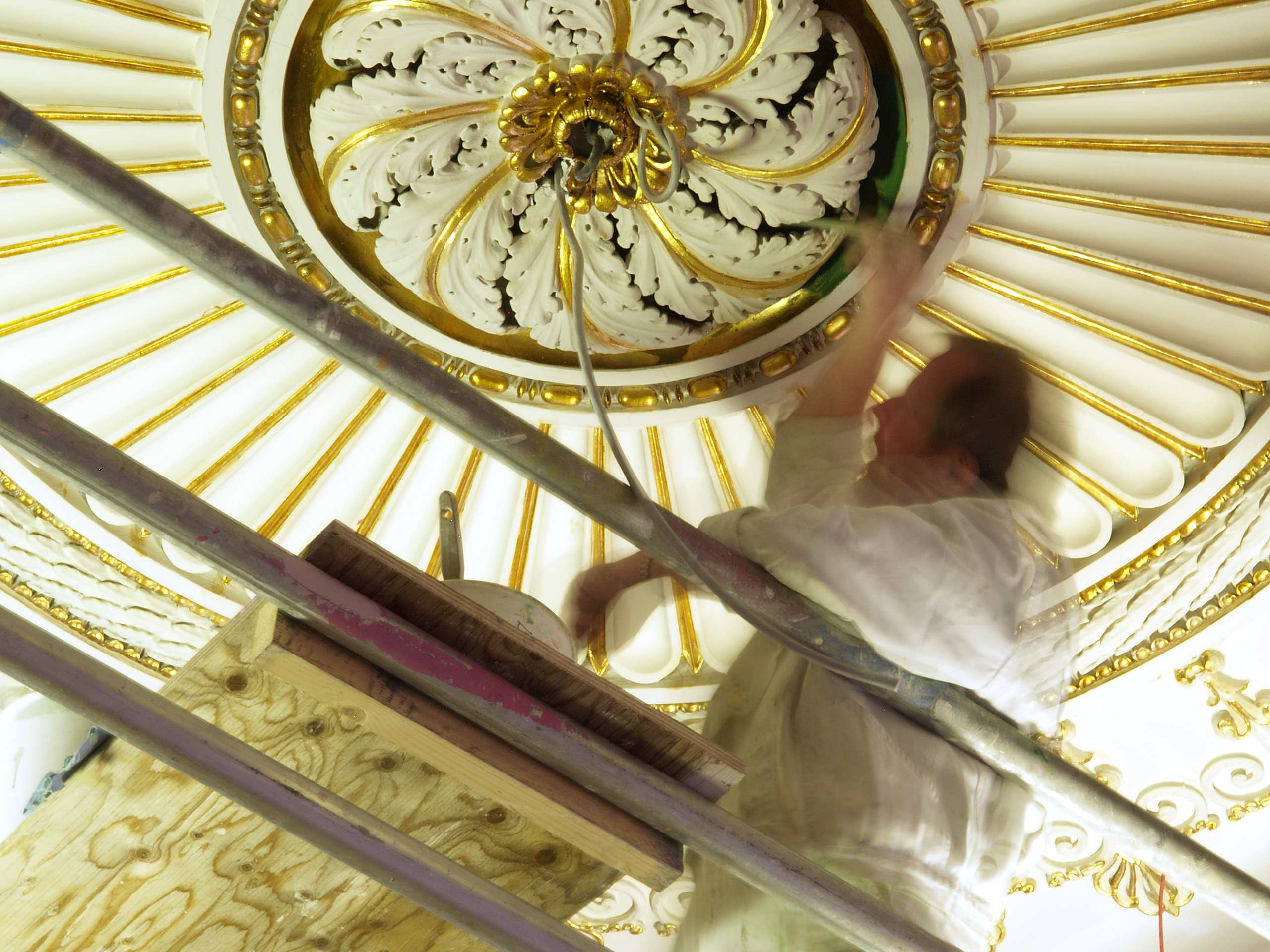 The painter working on the many details in the rosette in the Garden Hall – also called the Salon – on the piano nobile.
Pigment types that were available in 1828 were chosen in order to keep close to the historical model. Experiments show that there is a very great difference in effect between a ceiling painted with distemper coloured with modern colour paste-blends and one painted with pigments. This is because of the light-reflecting qualities of the colour pigments. In addition, many of the colours needed consisted of only one pigment, for example an earth colour, mixed with a greater or lesser quantity of chalk. Sometimes it was necessary to mix one’s way to the right shade by trial and error, partly because present-day pigments are much purer than those produced in 1828.
Some of the re-created colours in the Banqueting Hall. All the colours shown here are as close to the original colours as it was possible to achieve.
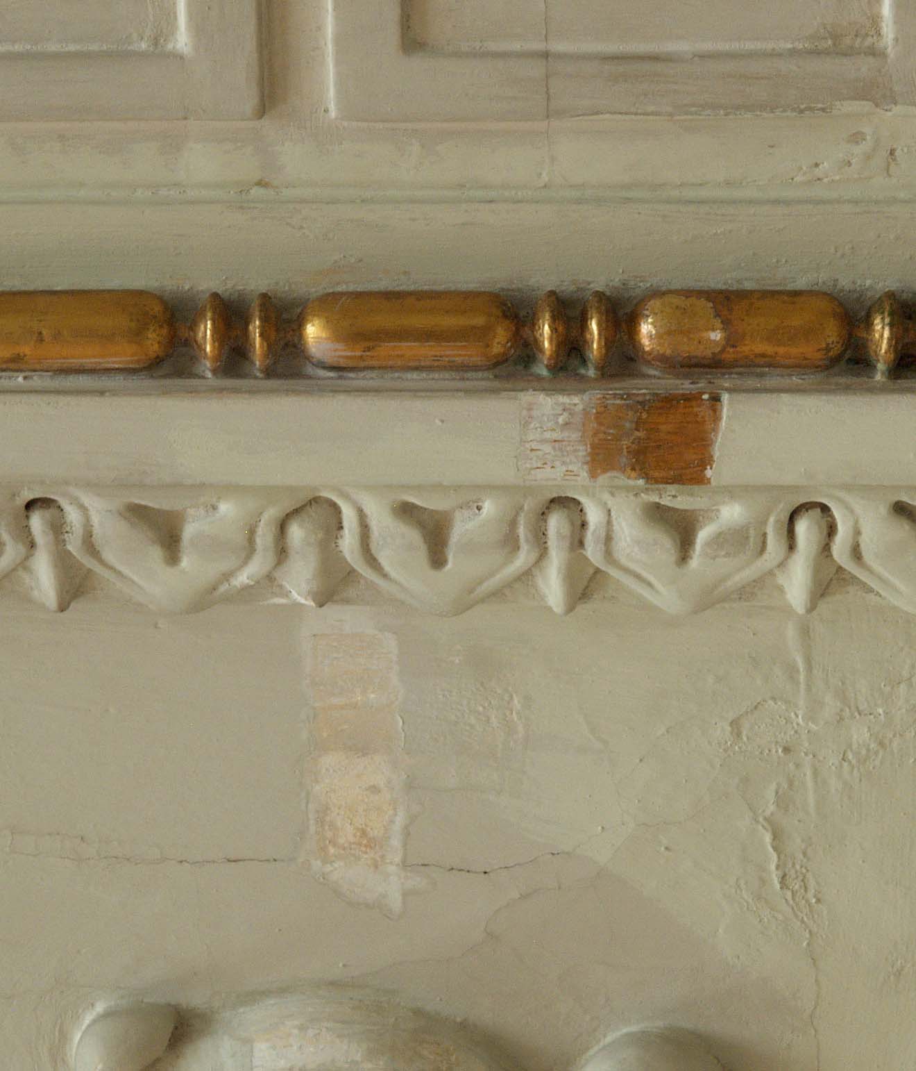
For the gilding-work oil gilding with sheet metal insulated with lacquer was used, in the same way as in 1828.
The woodwork was painted with linseed oil paint. Where it had to be regilded, the gold was applied first and afterwards the paint, in a warm pale grey shade, was applied carefully up to the gilding – just as in the Empire period.
Colour inspirations
The ceilings were painted first. Since virtually none of the original wall colours are known, the aim was to take inspiration from the ceiling colours when the wall colours were to be selected.
A further source of inspiration was a series of German Empire period interiors that were studied closely.
But there were many criteria to be taken into account in the choice of colours for the walls of these rooms.
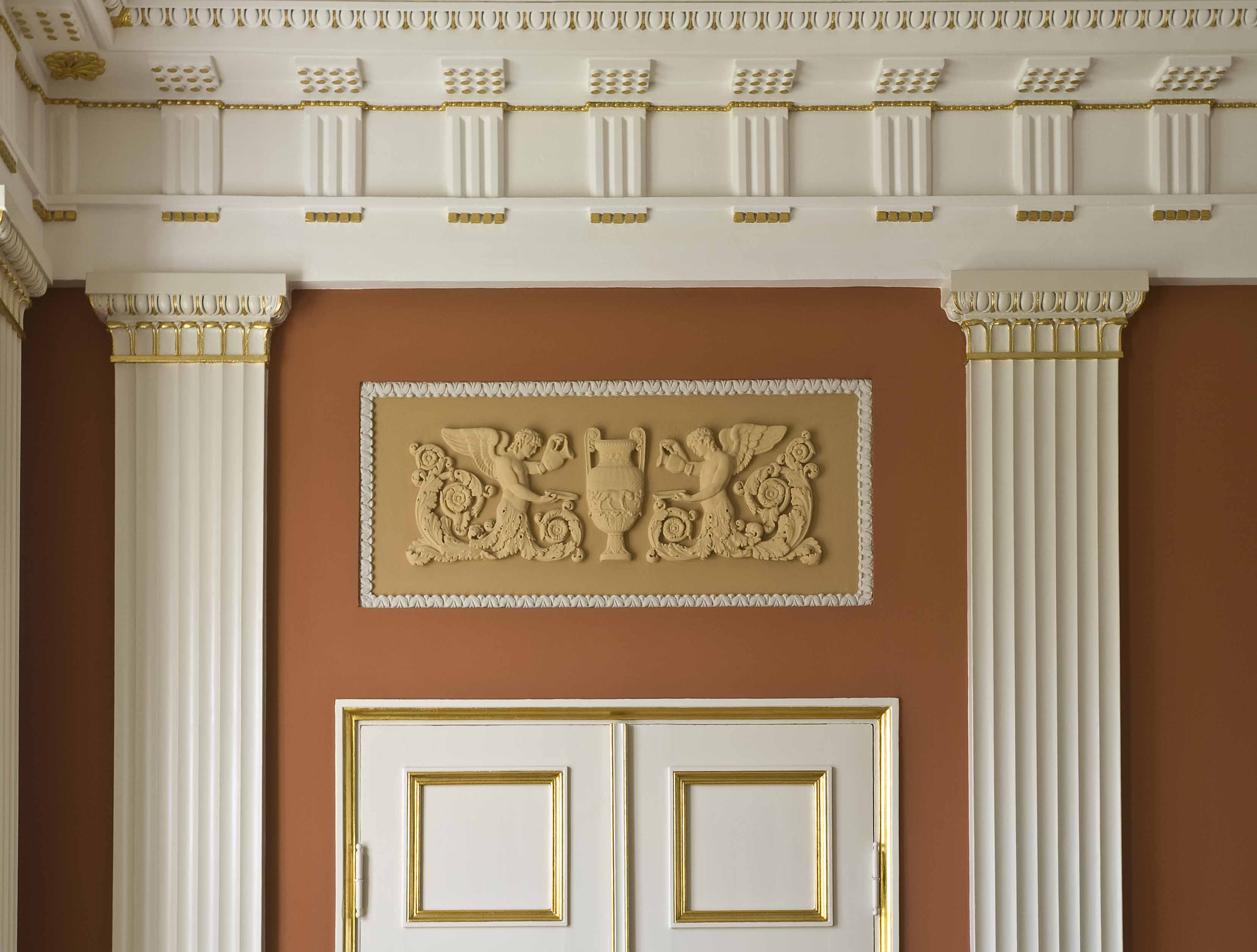
The wall colours had to be in harmony with the ceiling colours in each room, and in several of the rooms there were wall decorations to be taken into account. In the Garden Room on the ground floor, for example, there is a series of Baroque tapestries in blue, green and brown shades; in the old dining-room and hall – now rebuilt – there are the flower and fruit paintings by I.L. Jensen, and there is also the series of rooms in which 10 contemporary artists have been responsible for the artistic decoration.
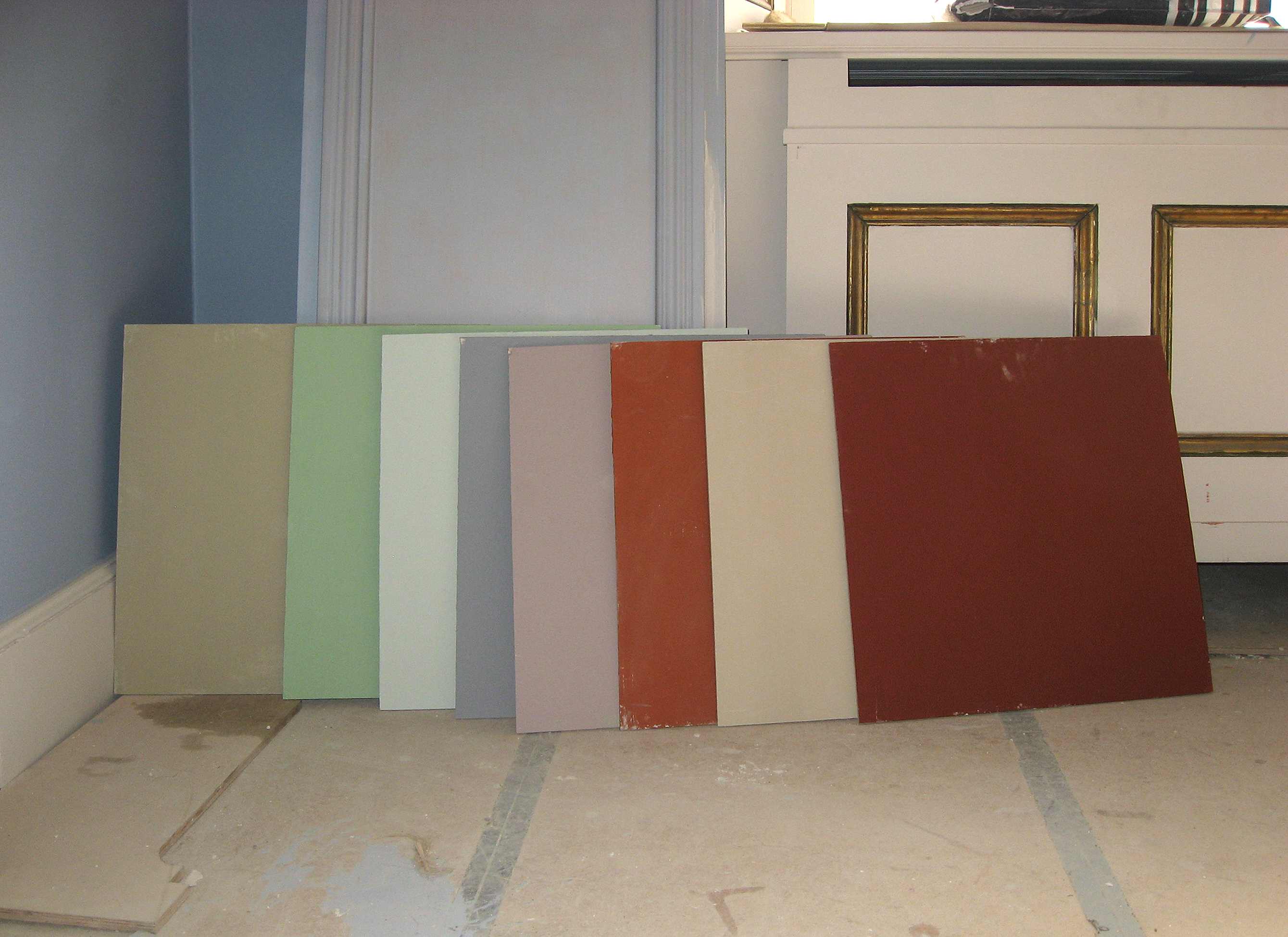 With the departure point in the palette of pigments that was available to the painter in 1828 a set of plates painted with coloured distemper was produced. All concerned were aware that the differences of light in the various rooms would produce very different effects and that it was therefore necessary to take large colour samples around when the colours were to be decided. A system was worked out with the colour samples being evaluated in relation to the light from the windows, the paintwork of the ceiling and the other forms of decoration. In some cases a new colour was tried out, and then the colour was adjusted and a larger trial area was painted on one of the walls. The adjusted colour was evaluated and if the effect seemed right the whole wall was painted. Then the colour was evaluated again. At that stage account also had to be taken of how the colour functioned in relation to the colours in the neighbouring rooms, and if the effect was satisfactory the whole room was painted. This was a long process, but it proved to be a good way of checking the colours.
 The wall colour in the Salon was not chosen until after the ceiling and woodwork had been painted.
The art project and the interior colours
In connection with the renovation, which in the case of the ceilings was a re-creation of the expression of a period in the past, expression of the mood of the present day was provided by the 10 contemporary artists who have created a number of artworks in the palace.
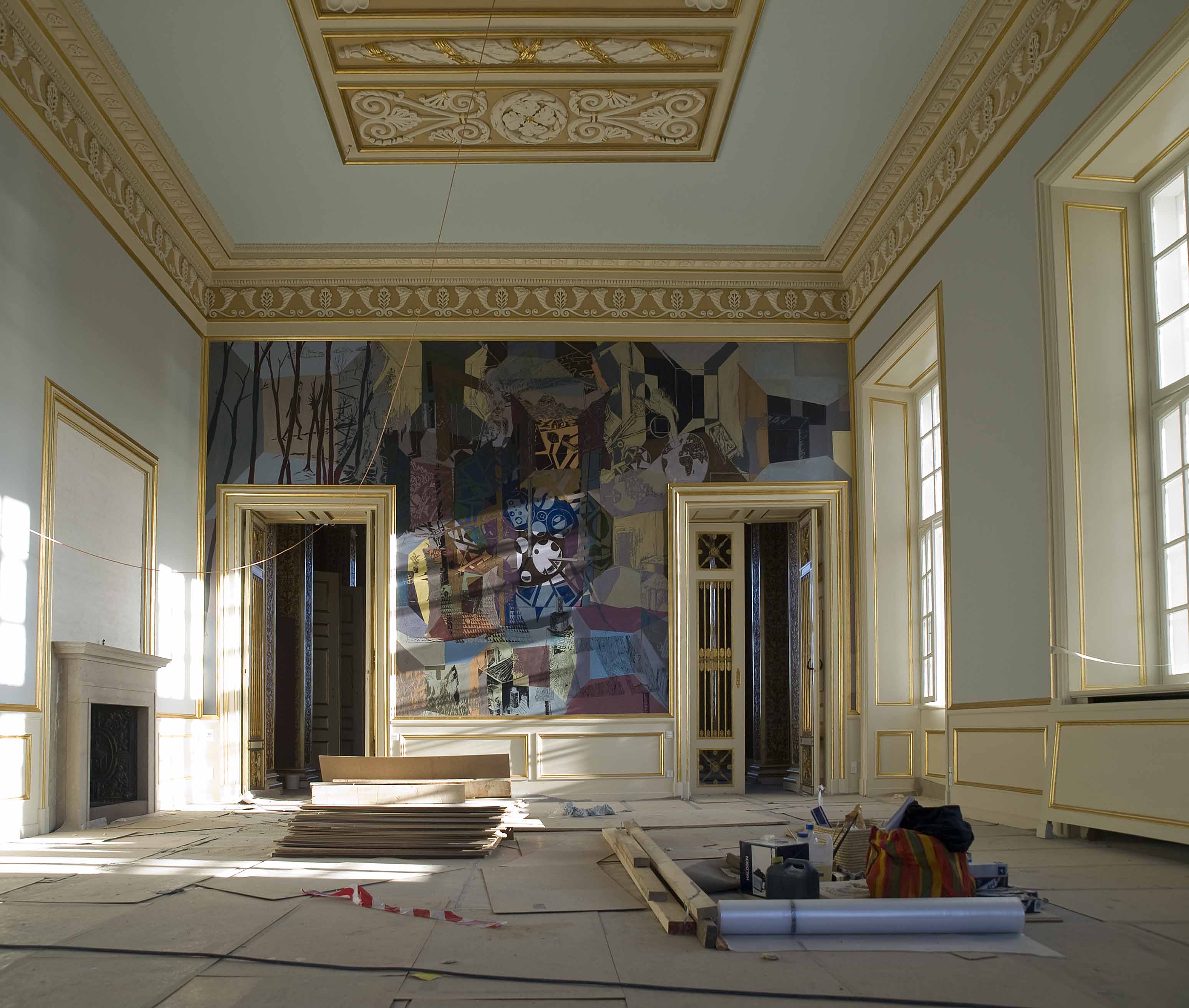
Kaspar Bonnen’s almost completed painting in the new dining-room of the palace
The artists were important contributors to the decisions about the colours of the walls in the rooms where they were working.
Before they began work they were informed about the colours that had been found on the ceilings and what they would look like when finished, and when the artists started their work in situ the ceilings were mostly completely finished.
The artists could choose either to work with the colours of the woodwork and ceilings or to work against them. They could take inspiration from the colours given or choose to work with a completely different form of expression.
In addition they could choose whether or not to be involved in the choice of wall colour in the room concerned. In most cases the artists participated actively in the decisions about the colours.
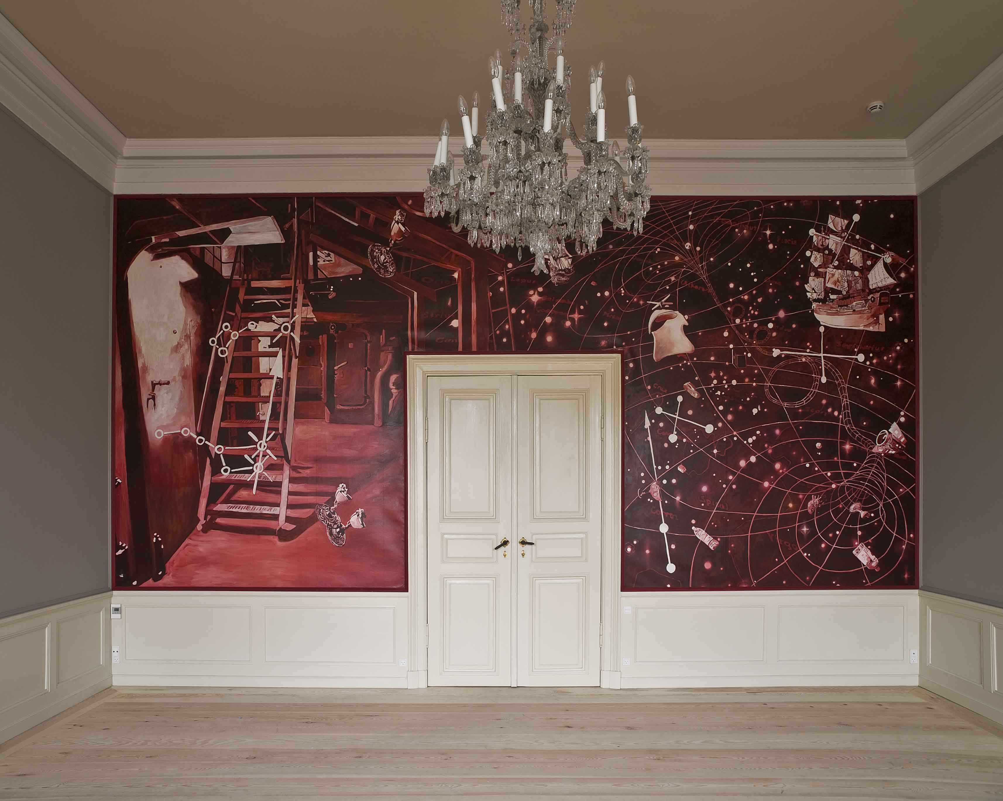 Morten Schelde’s painting in Frederik VIII’s Palace.
Exit
When all the craftsmen were finished and had left the building, Frederik VIII’s Palace remained there as evidence of three centuries of styles: the exterior of the palace, with its Rococo facade, the interior with its Empire period decoration, and the 10 artists’ fantastic works representing our own century.
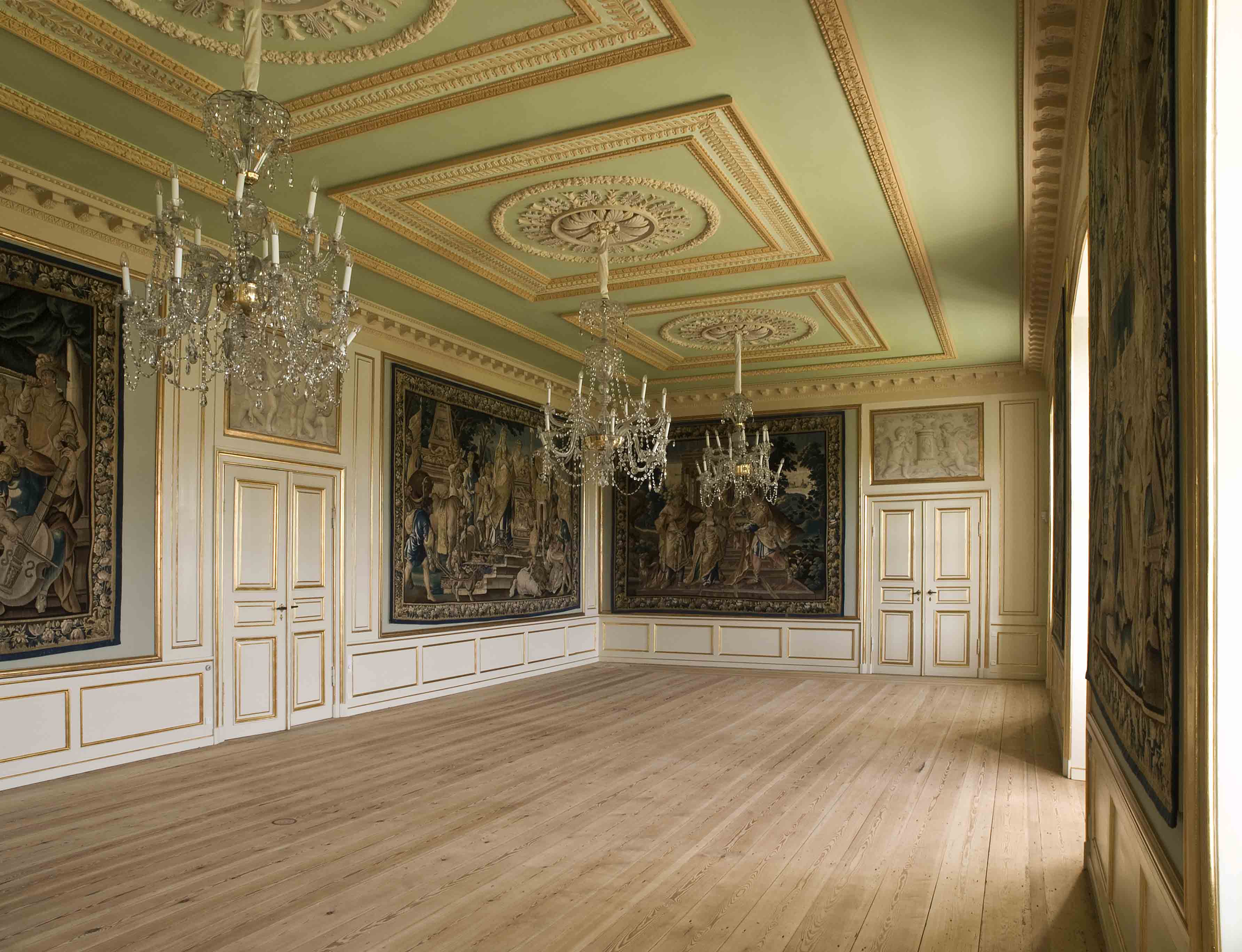 The Garden Room, or Tapestry Room, after restoration. The tapestries were also worked on by the conservators from Rosenborg and Amalienborg. First they were sent to be washed in Belgium. When they came back the conservators carried out repairs where the weave had been damaged and remounted them using a completely new system, which is more protective.