 Dansk
Dansk
 English
 Deutsch
Analysis of Hansen Koch’s Drawings
Understanding the colour aesthetic which was current in 1828 is littered with possibilities for making many mistakes. There are often no older written sources in the form, for example, of descriptions of rooms or inventories, and the interpretation must therefore also be based on other colour finds and illustrations from the time.
In 1828 the Empire style was dominant, which was inspired by the archaeological digs at Pompeii from 1734. In Frederik VIII’s Palace the particular French Empire style is found. Unfortunately Frederik VIII’s Palace is the only remaining example of precisely this style in Danish form. The masterpiece – the second Christiansborg Palace – was lost in the fire of 1884.
The only remains of this magnificent palace are a series of drawings by its architect, CF Hansen, and a set of black and white photos of the burned down ruin. There black and white photos are of little help, but the fine coloured drawings of the palace’s interiors show the colours in these rooms, and must be seen as a model for what Hansen Kock attempted to achieve in Frederik VIII’s Palace. Christiansborg was inaugurated in the same year as Frederik VIII’s Palace – 1828 – so the two building projects were contemporary.
Hansen Kock’s preserved interior sketches for the rooms on the piano nobile in Frederik VIII’s Palace are suggestions and not direct models, and there are quite a lot of differences between the drawings and the actual interiors, but it is nevertheless possible to define and interpret some of the principles which Hansen Kock used in his drawings and which he presumably also used in the palace.
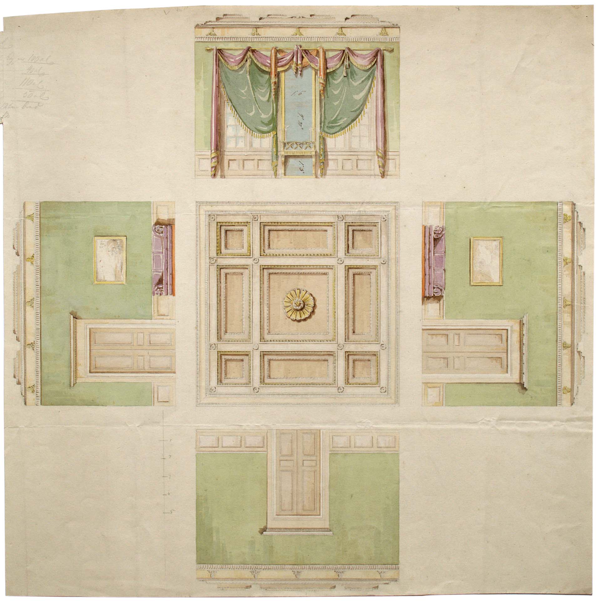 One of Hansen Kock’s suggestions for the furnishing of the rooms in Frederik VIII’s Palace from 1827.
In making a colour analysis of Hansen Kock’s drawings the following points are noticeable:
– All woodwork – panels, windows, and doors – have the same colour on all the drawings.
– The upper wall colour is the room’s dominant colour – often indicated by a colour of medium intensity.
– The strong colours in the room are found in the curtains and draperies – which are often in two strong, dark colours. These colours are in several cases complimentary colours.
– All the ceilings are painted. There is also more than one colour in the ceiling palette. In some places there is a great contrast between the colours. In others there is almost no contrast between the colours, but the difference here is in the colour itself.
– The use of gilding is very striking.
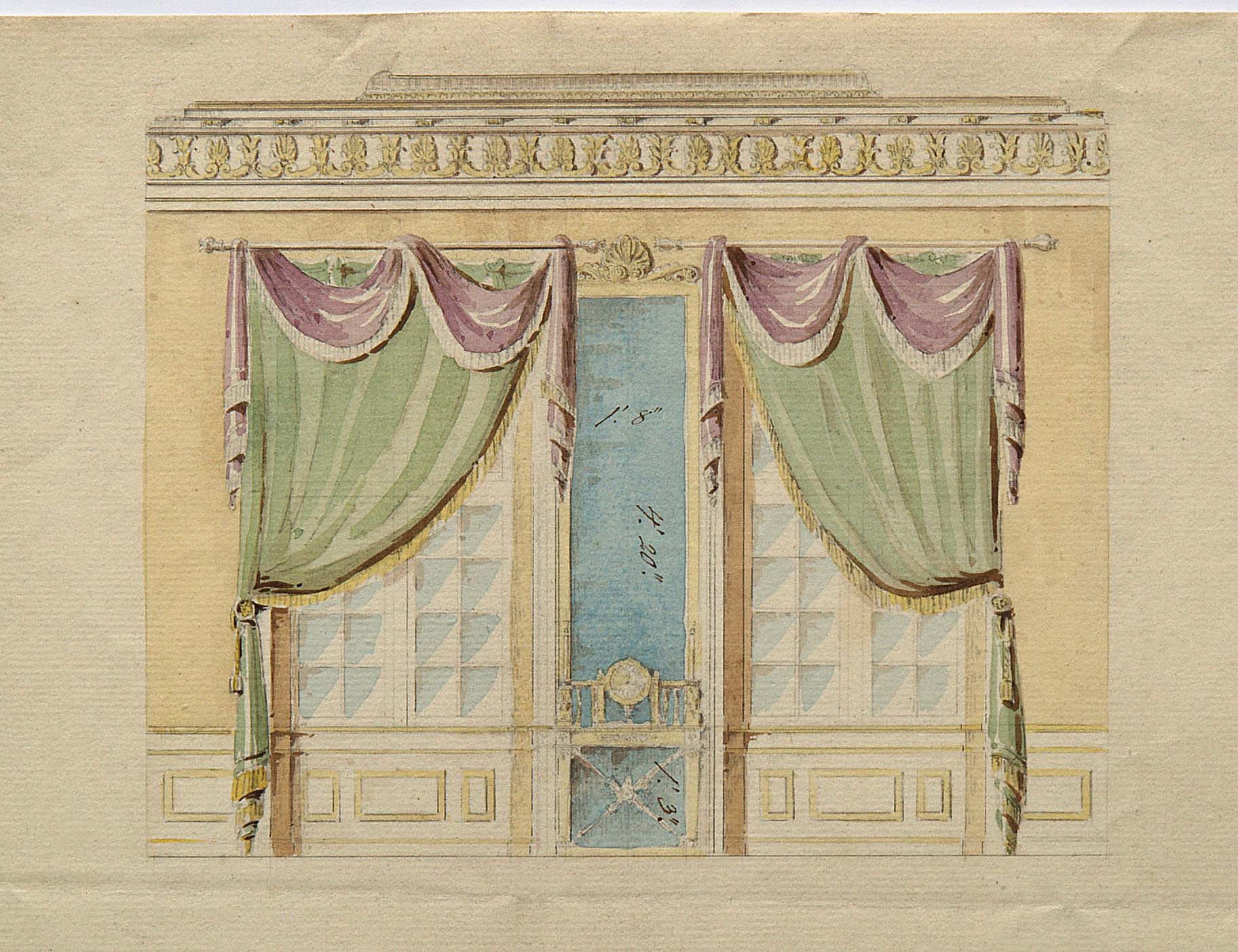 Detail of a wall with windows from one of Hansen Kock’s drawings.
In comparison with CF Hansen’s watercolours for Christiansborg Palace, Hansen Kock’s ceiling paintings are bolder than CF Hansen’s, which to a greater degree appear to favour a cool look with a combination of white and light blue colours and gilding.
From Drawing to Reality
In the process of Hansen Kock’ work on the furnishing of the rooms, changes occurred in relation to the drawings. The actual rooms were refined in terms of effect, and decoration and colour were calibrated in relation to size and position.
From the inventories we know that Hansen Kock followed the colour disposition on his drawings with regard to tapestries, curtains, and draperies – though only the words yellow, blue, purple etc were used: we cannot unfortunately know what intensity the colours had in these sections.
Goethe’s Theory of Colours
There can be no doubt that Hansen Kock was acquainted with Goethe’s Theory of Colours. The book, in which the German poet and scientist relates his colour experiments, was published in 1810. In Hansen Kock’s colour palette there are many examples of precisely the colour combinations which Goethe put together in order to attain colour harmony.
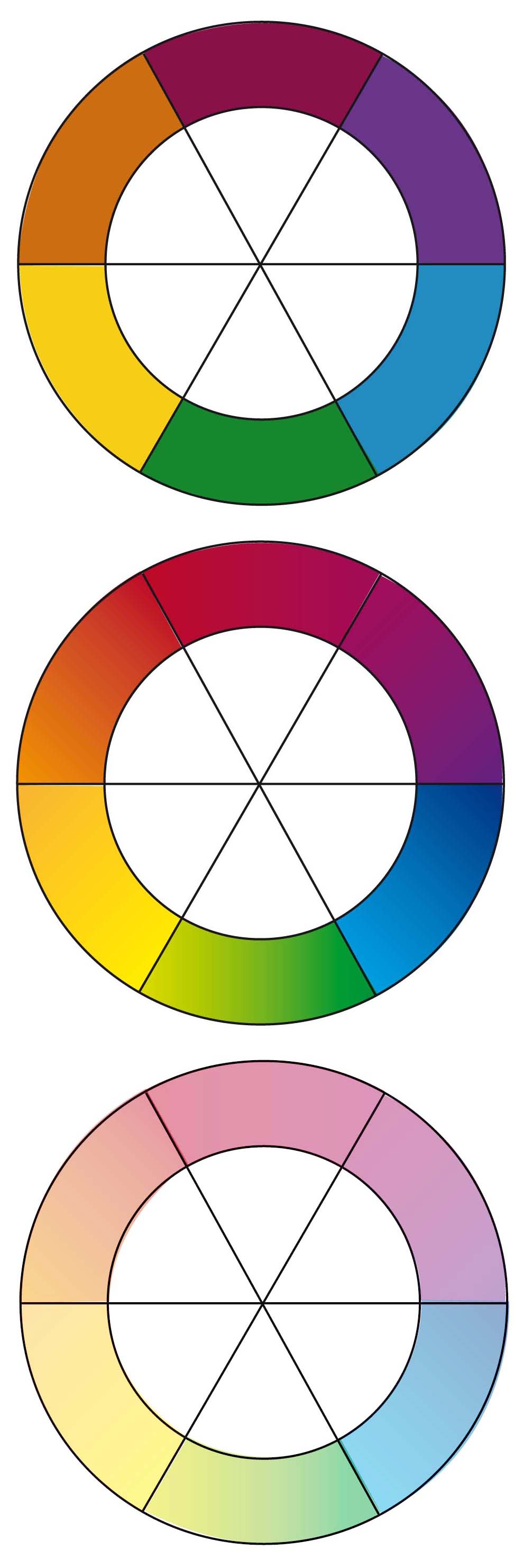
Top: Goethe’s colour wheel with primary colours, as Goethe shows them in his work of 1810.
Middle: The same colour wheel with softer transitions between the colour tones.
Bottom: The colour wheel with light versions of the colours, which were used on the ceilings on the palace.
A good example of Goethe’s colour wheel is the colour combination on the ceiling of the pantry (then a drawing room) where a light yellow is used against a light purple, supplemented with a light grey, neutral colour. The first two colours are placed exactly across from one another on Goethe’s colour wheel and should, according to his colour theory, create great harmony.
According to Goethe, harmony arises when cold/warm, negative/positive, or complimentary colours are in balance.
In the rooms where there are ceilings where there isn’t great contrast between the colours, we must presume that Hansen Kock gave the upper wall colours a contrasting colour, as for example in the meeting room (the then footman’s chamber) where the ceiling, which is today decorated by Eske Kath, was in 1828 painted with two light earth tones. During the archaeological investigation of the colours, one of the few places where the original upper wall colour remained was found here – a very strong turquoise in a strong middle tone with light decorations. Exactly the colour one could expect to find across from earth tones on Goethe’s colour wheel.